REALTOR
Native App
Mobile

Problem Statement
Homeowners using the Realtor.com app face a fragmented and confusing digital experience when preparing to sell their home. Core tasks like understanding home value, setting a competitive price, choosing the right timing, and selecting an agent require too many steps across disconnected tools—creating uncertainty and making it harder to feel confident throughout the selling process.

As a result, homeowners rely on scattered information, informal advice, and guesswork to make high-stakes decisions. The lack of a centralized, data-driven platform leads to unrealistic expectations, poor financial planning, and limited ability to compare agents effectively, reducing collaboration between homeowners and agents and weakening the platform’s ability to support successful transactions.
Business Goals
To address these problems.The business defines the goals for the app

Simplify home selling journey into intuitive experience

Improve seller agent through comparisons

Realtime property value estimators

Centralized tools into integrated a single interface

Support strategic personalized market
My Role
As a Senior UX/UI Designer I lead the strategy in the UX experience and User interface. I worked closely with product managers, accessibility specialists, stakeholders, and other designers to bring clarity and usability to the app experience.
Ux Research Plan
Empathize Stage
I define clear objectives, identify key participants, and shape a timeline that would lead to meaningful, actionable insights
What challenges do homeowners encounter when preparing to sell their home?
How do homeowners currently find and evaluate information to make decisions about pricing, timing, and agent selection?
What features or experience would help homeowners feel more confident and in control when selling through a website?

Metodology
I applied the User Center Design—an approach that allowed me to deeply connect with users and uncover meaningful opportunities.
Interviews
I conducted 6 structured interviews. This qualitative approach allowed me to uncover the root causes behind their frustrations, behaviors, and beliefs around managing product lists.

Sarah

Emily

Andrew

Olivia

Ryan

Jared
Interview Questions
I define a set of structured questions that would allow me to capture actionable insights from the very first interaction. These questions helped guide each session while still allowing space for users to expand and share their unique experiences.

"I’m not sure how to price my home. I don’t have up-to-date market info I can trust."
"I want simple alerts that clearly tell me when it’s a smart time to sell. "
Interview Insights
"Choosing an agent feels like a risk. I don’t know who’s actually good.."
"I look for info everywhere, but it’s all over the place and hard to understand."
"I feel confident when I get clear, honest guidance from the platform."
"I want simple alerts that clearly tell me when it’s a smart time to sell."


Surveys
I run surveys with 7 participants to broaden our understanding and move beyond anecdotal feedback and bring in measurable insights that directly influenced our design decisions.
Survey Template
I crafted questions around four key areas:
-
General Workflow
-
List Structure
-
Priorities
-
Pain Points
-
Tools & Automation


Survey Results
Key insights from the survey areas:
-
Multi-channel selling research and tool switching
-
Difficult pricing and timeline decision clarity
-
Moderate confidence in key selling decisions
-
Agent comparison lacks meaningful differentiation
-
Strong need for a centralized selling dashboard

Competitive Analysis
I carried out a competitive analysis to understand how other platforms approach product lists
Competitive Analysis Results
I used template for my analysis. It served as a strategic tool to validate our direction and highlight where we could stand out


Competitive Key Funcionality Analysis
This analysis allows me to identify key opportunities to improve the user experience.

User Persona
Define Stage
Sarah, a working professional and first-time home seller, is preparing to list her family home while managing a busy schedule and relying on Realtor.com to estimate value, understand market timing, and compare agents—seeking clear step-by-step guidance, trustworthy insights, and a centralized selling dashboard that helps her make confident decisions, avoid costly mistakes, and complete the entire process in one place.

Persona
Template of the user persona with all the details.
User Journey
I map a User Journey, detailing each step that users follow in their current workflow. I identifies moments of friction and what Sarah thinks and feels during her experience.

Ideation (Stage)
With a clear understanding of Sarah paint points and needs, I start to design in collaboration with the design team and developers.

Sketching (Stage)
With a clear direction set, we move into the sketching phase. Using Figma and FigJam, the team collaborates closely to explore early design ideas, wireframes, and user flows.
Prototyping
We move from sketches to interactive prototypes. At this stage, we begin testing core interactions and flows

Iterations
I went through several iterations in the design, based on internal reviews and preliminary testing sessions.


User Testing Document
I defined the scope of the user testing
User Testing Questions
In user testing with eight participants, I find that 10% of tasks were completed successfully, but 90% of users had difficulties.

Testing Feedback
Different stakeholders shared their feedback, revealing usability issues and overlooked needs that could affect adoption.


Testing Results
Their feedback uncovers moments of confusion and friction—such as unclear permissions, irrelevant search results, and slow updates. As a result I get a big and clear picture of everything that needs to improve.
Iterations
These insights guided the next iteration of design.
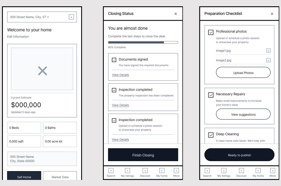
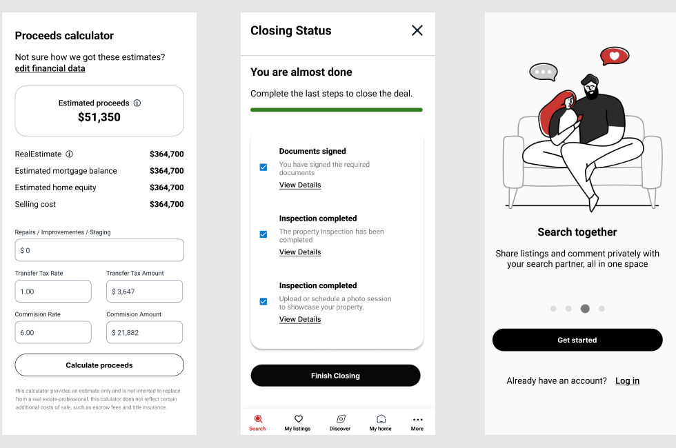
Final Mockup
This final mockup represents the consolidated design solution, integrating validated feedback, refined interactions, and visual consistency to support a clear, usable, and scalable experience.

Key Results
With the launch of the united healthcare redesigned app, users began experiencing real, measurable improvements in record time.

Increase seller confidence using integrated pricing

Improvements in timing accuracy for home listings

Reduction in time to identify and compare agents

Unified interface replaced fragmented tools

Increase in data driven actions per session with tool integrations
Next Steps
Looking ahead. The focus now shifts to refining the tool based on real user and stakeholder feedback collected during this rollout.
At the same time, Track and address any design debt introduced during new revisions—ensuring future iterations are smoother, smarter, and even more aligned with business goals.
